Back to homepage
A new brand designed
to earn trust from one
We redefined Arena’s brand and identity to establish clarity, cultural relevance, and credibility in a competitive UAE real estate market.
Brand Strategy | Brand Architecture | Rebranding | Brand Identity Design
Scope
Brand strategy and full rebranding to establish Area Real Estate as a credible, scalable developer brand within the UAE real estate market.
About client
Area Real Estate is a newly established real estate developer operating in the UAE, entering a market defined by high competition, sophisticated buyers, and strong expectations around trust, clarity, and long-term value creation.
Challenge
Arena entered the market with an identity that relied on abstract symbolism and generic visual language. The brand lacked a clear relationship to real estate, place-making, or development logic, making it difficult to communicate credibility, intent, and long-term ambition in an extremely competitive market.
This created a strategic risk: without a grounded brand system, the company would struggle to differentiate, earn trust, and scale into multiple assets or developments with consistency. The challenge was not aesthetics, it was positioning Arena as a serious, future-facing real estate brand from day one.
Solution
Brand strategy
We defined Arena’s positioning as a real estate developer focused on building long-term value and not just delivering individual projects.
This included clearly articulating its USP, vision, mission, and values giving the brand a clear anchor that could guide decisions, communication, and future growth. A brand architecture was established to support Arena’s future expansion into multiple developments and assets types.
Identity redesign
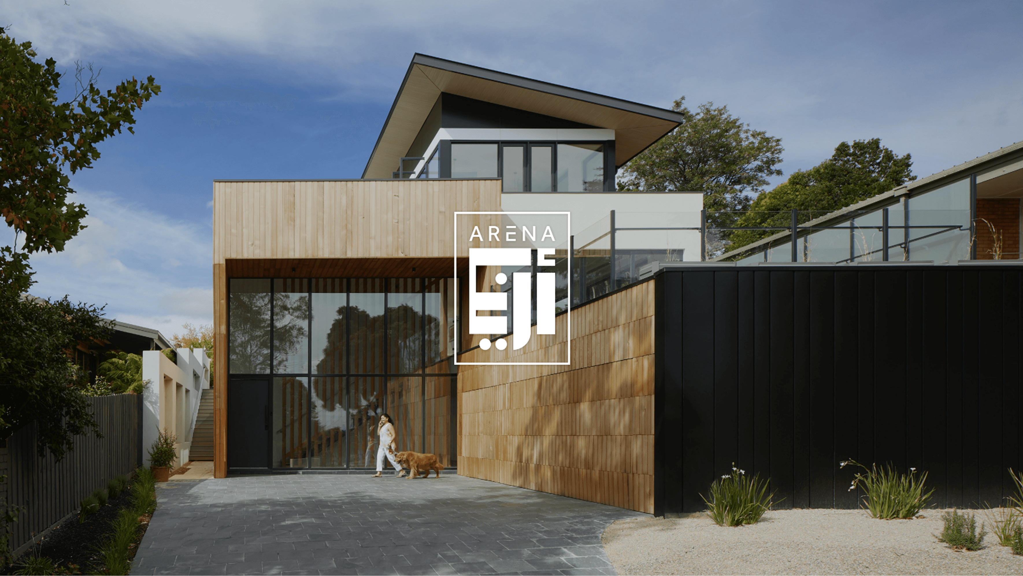
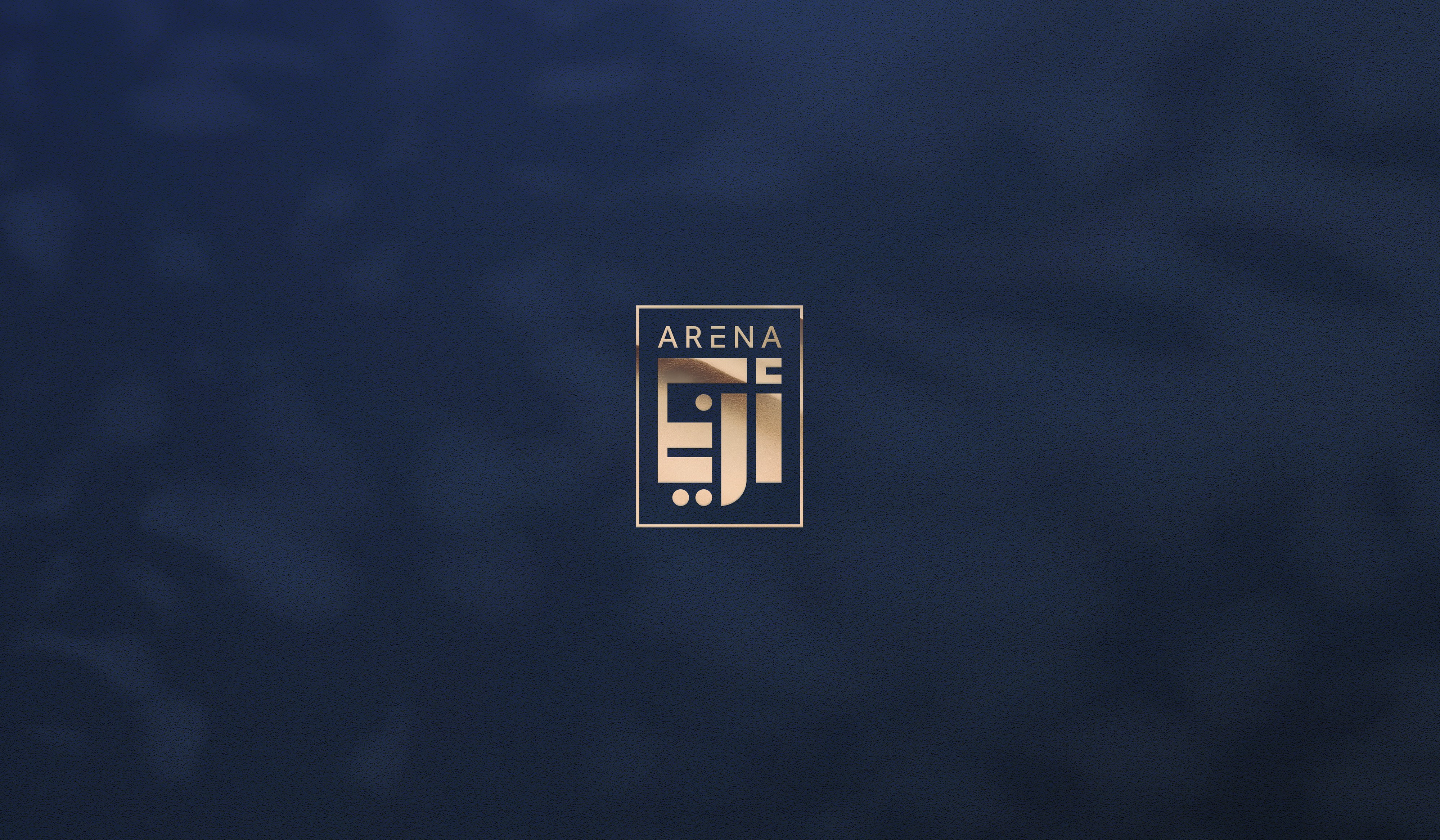
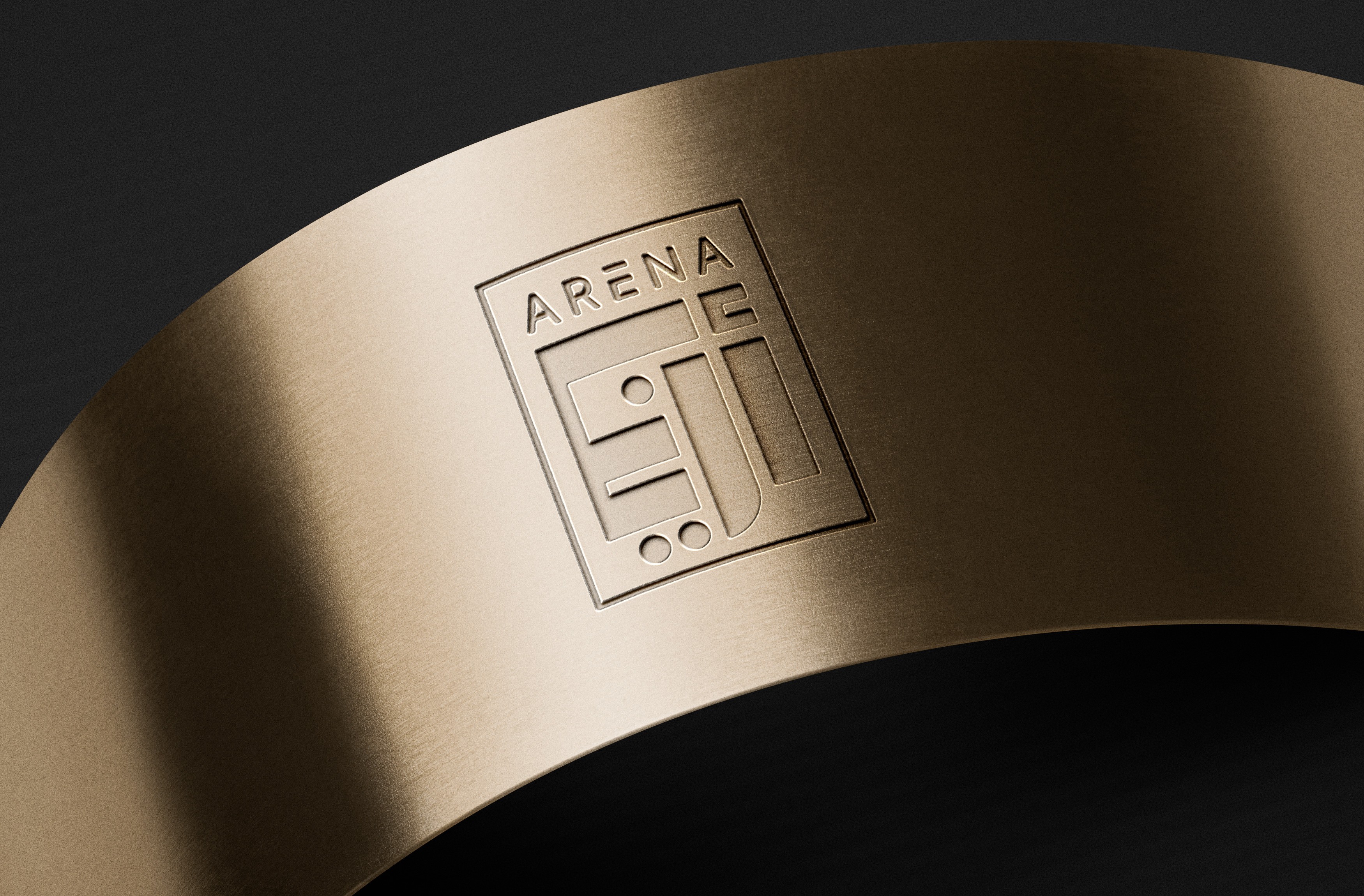
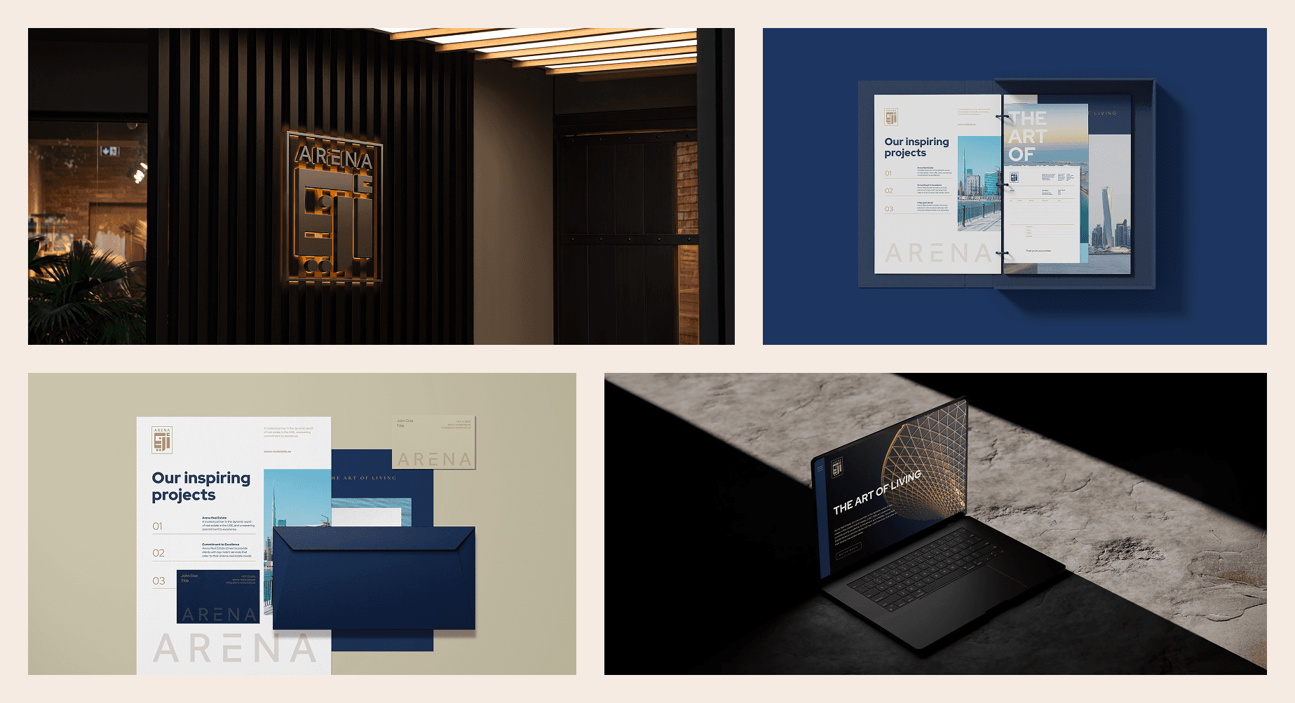
The existing star-based logo was replaced with a mark derived from the Arabic name “أرينا”, constructed using architectural and floor-plan logic.
The form references space and structure, making the brand linked to real estate rather than abstract symbolism.
Visual system
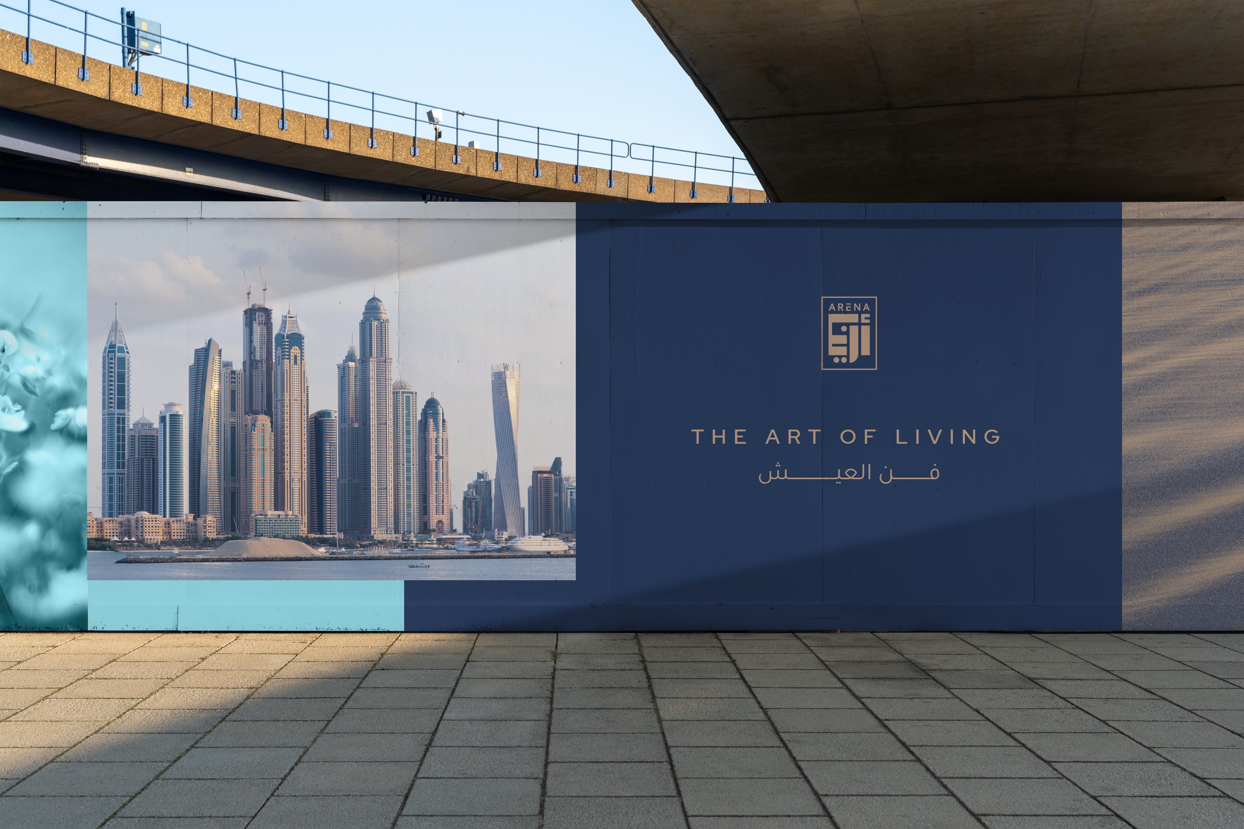
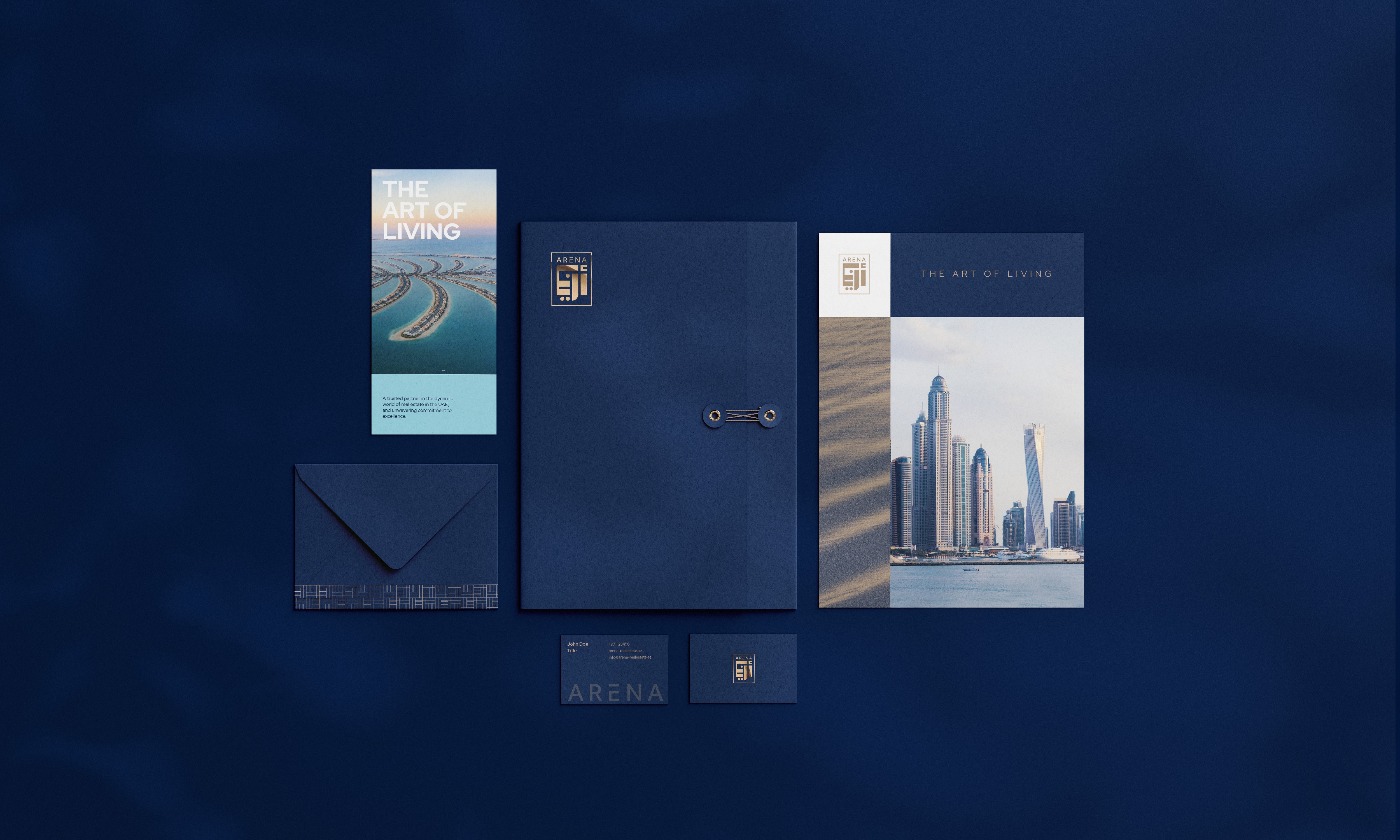
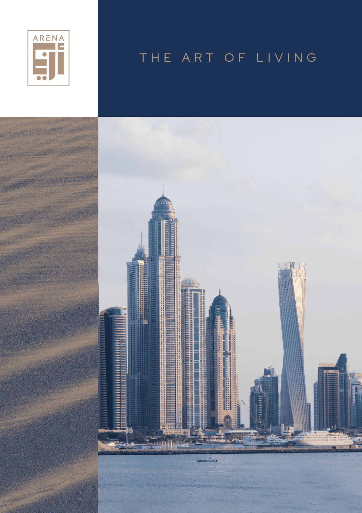
A new color palette and visual system aligned with premium real estate positioning of the brand.
The brand’s blue was retained to preserve continuity, while gold was introduced to signal value, permanence, and investment credibility.
Collaterals
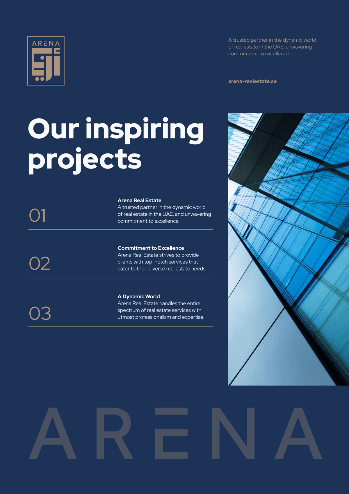
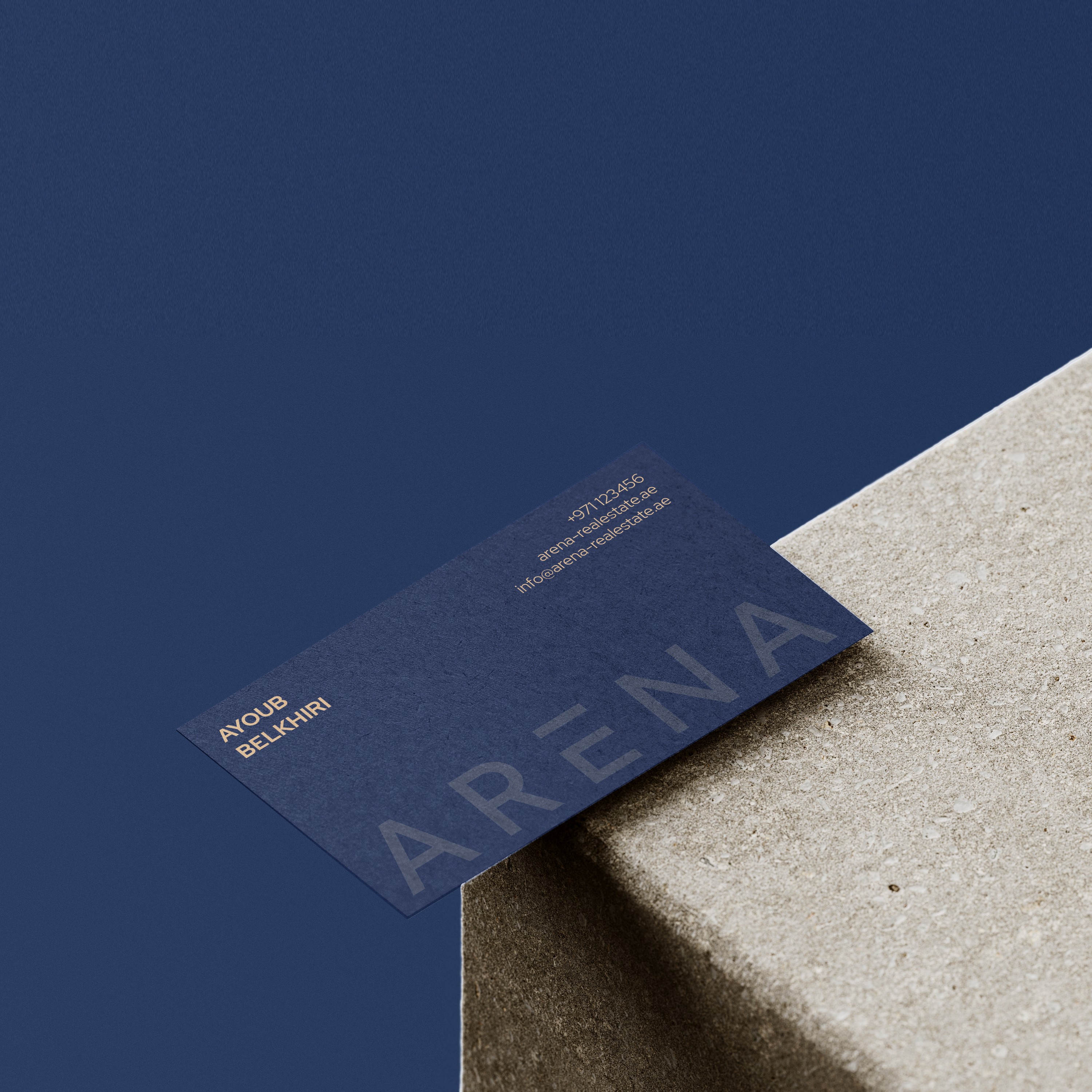
The strategy and identity were translated into a practical brand system covering core collaterals, sales materials, and foundational communication assets.
This ensured Arena relaunched with clarity, consistency, and control across all touchpoints.
Results
The rebrand delivered impact across brand perception, market readiness, and commercial execution.

30-40%
Fewer brand-related clarifications
after introducing guidelines.
+15-20%
Increase in inquiry-to-meeting
from stronger first impressions.
+25%
Faster rollout
of sales and marketing materials.